Antoine Ricardou founded the Be-Poles agency in 2001. Specialising in the construction of brands, through logos, but also their multiple variations in architecture and design, the company has 2 offices in Paris and New York and employs around twenty people. It has just created the new identity of the IMOCA class. Its founder explains the process and his desire to collaborate in offshore racing and pleasure boats.
How and why did IMOCA come to Be-Poles?
Antoine Mermod's wife [editor's note: the president of the IMOCA class association] works in scenography for museums, and she advised him to leave the profession, which is very preemptory for some people. There is efficiency in the current work, but when you enter other worlds of our sport, like the America's Cup or Volvo, the boats have different heads. Puma or Mapfre have different graphic identities. So he wanted to take a pro at branding and not sailing, even though I'm sailing. He told me, I've just made a great deal with the Volvo, we want a strong image.
From an operational point of view, how did it go?
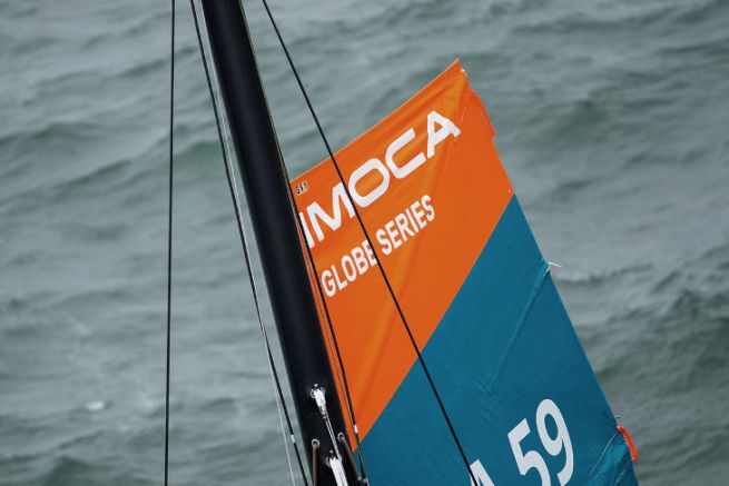
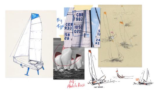
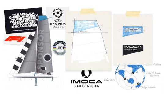
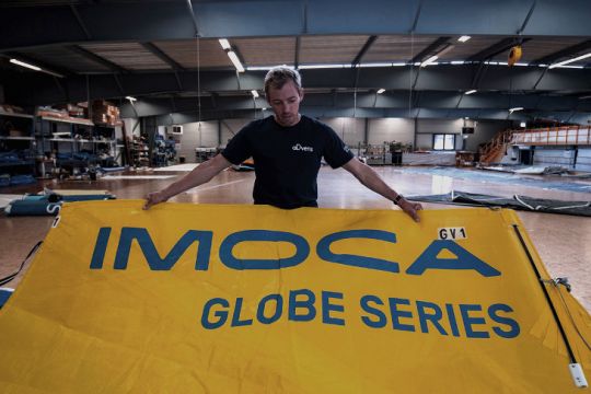
I really didn't want to come here with my prejudices as a sailor. I let my teams work. I have a guy who's a football fan and has wanted to work with a club for a long time. We tried to see how we could improve the image of the sport with references from major brands that carry the sports corporations such as FIFA or Formula 1. The idea was to have a significant element that is not perceived as a burden, like the bubble stuck over the sponsor on the sail. The new logo can be integrated with the choice of colours. The typography represents speed, shock, power. When I went to the Azimuth Challenge, I found that the skippers didn't see it as a constraint, it's proof that it works.
Are there any other projects in the boat?
It was the second time we touched the marine world after the orange logo on the muzzle of the sailboat Tara. It makes you want to make complete ocean racing boats. In yachting too, it would be interesting to work on the emergence of brand systems as is done in the automobile industry.
