Adapting to new uses
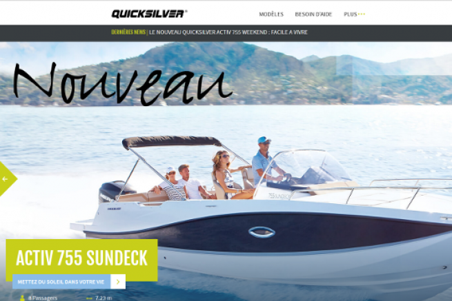
Quicksilver found that more than half of its customers connected to its site from their mobile phones or tablets. It was therefore essential for the boat brand to offer them a responsive website adapted to this new use. For this, image scrolling and panoramic formats are favored, with limited resizing. Only the essential menus related to the products are visible. The annex pages are grouped under a plus tab, in order to facilitate readability. Several powerful tools have been developed to limit users' search time.
An effective search tool
By scrolling down the home page, the customer can immediately choose to view all or part of the Quicksilver models depending on its use. A side menu allows an advanced search for models according to layout, size or motorization criteria. In very few operations, visitors can list the boat models that meet their expectations.
Comparators
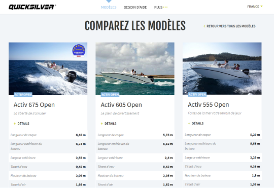
A comparison tool allows you to evaluate up to 3 models. It allows a fast and simultaneous visualization of all the technical data related to each type of boat.
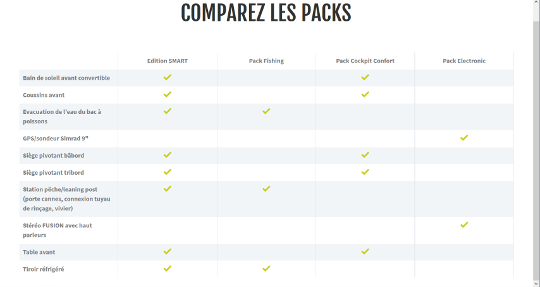
A pack comparator allows him to make his choice between the different offers for the same boat.


Continuous improvement
Quicksilver announces that its site will continue to evolve over the coming months. He invites the Net surfers to share their remarks to allow a continuous improvement.


