A group Made In France
For its 40th anniversary, the Charentais multihull specialist Fountaine Pajot has offered itself new logos to promote the growth strategy mentioned in these columns . The separation of the group's activities from the sailing and motor catamaran sectors is the basis of the work.
A first logo, intended for the group's communication, shows the necessary sobriety for institutional information, with a discreet black font. It will be used for documents aimed at shareholders and professionals. A reminder of the red blue-white in the image will allow the promotion of Made In France, the distinguishing feature of Fountaine Pajot, while the signature"Sailing the World since 1976" highlights the history of the yard.
Motor Yacht before being a catamaran
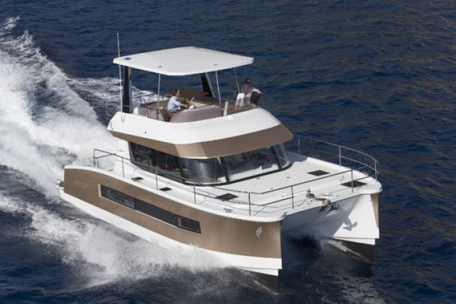
The grey Fountaine Pajot Motor Yachts logo makes the concept of catamaran for motor units disappear. Indeed, if the catamaran brings advantages of comfort and consumption, it is not for the buyers of motor boats an essential criterion. Fountaine Pajot is therefore counting on a less closed image to conquer a market he considers the most promising in the years to come.
A reference for sailing catamarans
On the other hand, with its dynamic red colour, the Fountaine Pajot, Sailing Catamarans logo is based on the sporting image of the multihull sailing boat. Known as a pioneer in the sector, the charentais shipyard insists on the pleasure of living aboard catamarans and rejuvenates its image.
With the communication tools in place, Fountaine Pajot has yet to win its bet on the engine sector and continue the growth posted in recent years.
